This short article demonstrates tips for improving your CSS knowledge. Included are links, examples, and code showing many features of CSS. You will be shown sections that break down the basics of CSS into absorbable and easy-to-understand pieces. You’ll learn the main aspects of CSS function and how to apply them successfully in your projects.
Note: CSS is an acronym for Cascading Style Sheets. It is a language for describing the appearance of web pages, such as colors, layout, and fonts, to make our websites appealing to users.
The following CSS fundamentals will be covered:
- Understanding the Box Model
- Selectors in CSS
- The Function of Cascade and Specificity
- Inheritance in CSS
- Defining Colors in CSS
- CSS Box-Shadow
- Using Gradients in CSS
- Text Spacing and Placement
- Filters is CSS
- Flexbox
Related Articles
Understanding the Box Model
In CSS, the box model is a set of rules that govern how your web page is displayed on the internet. For HTML elements, a rectangular box is generated in this model. Each element is arranged according to its size, type, placement, and relationship to other components and external criteria such as viewport size. Content, padding, a border, and a margin make up this box.
Content
The content area contains images, writing, and other types of media content. The box dimensions can be changed using the height and width attributes.
Padding
The padding area is the space around and within the border-box that surrounds the content area. It can be applied to the entire box or just one or more of the sides – top, right, bottom, and left.
Border
The padding and content are surrounded by the border area, which can be applied to all sides of the box or chosen sides – top, right, bottom, and left.
Margin
The space between the border and the margin is the margin area. The margin has no background color of its own and is fully transparent, and it displays the element’s background color, such as the body element.
Selectors in CSS
CSS uses selectors to select HTML components that we wish to style on our web pages. CSS selectors come in a range of variety, providing fine-grained accuracy when styling elements. We’ll go through each type in great depth to see how they function.
The Different Selector Types
- Element Selector
- Id Selector
- Class Selector
- Universal Selector
- Group Selector
How can you make some text bigger and blue if it’s simply the opening paragraph of an article?
<draft>
  <p>I want to be Blue and larger than the other text.</p>
  <p>I want to be normal sized and the default color.</p>
</draft>
To add properties to that specific element, you use a CSS selector and apply a CSS rule like this.
draft p:first-of-type {
  color: #ffa000;
  font-size: 1.6em;
  text-align: center;
  line-height: 70vh;
  background: #474747;
}

draft p:nth-of-type(2) {
  line-height: 30vh;
  text-align: center;
  background: #d09964;
}
We used the ::first-of-type and ::nth-of-type(2) CSS pseudo-class selectors to select the first and second paragraphs separately.
Result

The Function of Cascade and Specificity
When numerous CSS rules apply to an HTML element, the cascade algorithm is used to resolve conflicts. The order in which CSS rules are applied matters. When two rules with equal specificity apply, the one that appears last in the CSS is utilized. Let’s look at the example below using a custom element name.
<custom-element>My color is Blue</custom-element>Here we have two duplicate CSS class names.
custom-element {
  color: red;
}

custom-element {
  color: blue;
}
Result

In the above example, there are two rules that are created for the <custom-element>. The custom element (<custom-element>) is colored blue because these rules have the same selector and specificity, so the last one in the source order wins.
Specificity
Specificity is a measure of relevance in CSS and is dependent on the type and order of CSS selectors. When numerous CSS selectors target the same HTML element or set of elements, the principles of specificity allow browsers to identify which CSS declarations are most applicable to the HTML element and should be used.
Inheritance in CSS
Inheritance is something that happens in real life. Offspring inherit their parents’ physical characteristics, and tall parents have tall children and vice versa.
What about in CSS? Inheritance happens there too.
In CSS, inheritance determines what occurs when a property on an element has no value given. If no CSS property is specified, the child element will sometimes inherit the value of the CSS property from the parent element. A great example of inherited property is the CSS font-size.
CSS properties are divided into two categories.
- Inherited properties, which are set to the computed value of the parent element by default
- Non-inherited properties, which are set to the property’s initial value by default
Defining Colors in CSS
Color is a significant element of any website, and CSS provides numerous color types, functions, and treatments. CSS supports a variety of data types, including strings and numbers. Color is one of these types, and it defines itself using other types such as numbers.
Hex Colors
Hexadecimal notation (commonly abbreviated to hex) is a shorthand syntax for RGB, assigning a numerical value to the three primary colors of red, green, and blue.
h3 {
  color: #b71540;
}
The hexadecimal ranges from 0-9 and A-F. When used in a six-digit sequence, they are translated to the RGB numerical ranges of 0-255, which correlate to the red, green, and blue color channels.

RGB (Red, Green, Blue) color
RGB colors are interpreted by rgb() color function, which uses numbers or percentages as parameters. The numbers must be between 0 and 255, and the percentages must be between 0 and 100 percent. RGB operates on a 0-255 scale; thus, 255 equals 100 percent, and 0 equals zero percent.
h3 {
  color: rgb(96, 163, 188);
}
In RGB, black is defined rgb(0 0 0), which stands for zero red, zero green, and zero blue. The color black is also known as rgb(0 percent, 0 percent, 0 percent).
White is defined as rgb(255, 255, 255) or rgb(255, 255, 255) and equals (100 percent, 100 percent, 100 percent) which is the polar opponent of white.

HSL (Hue, Saturation, Lightness)
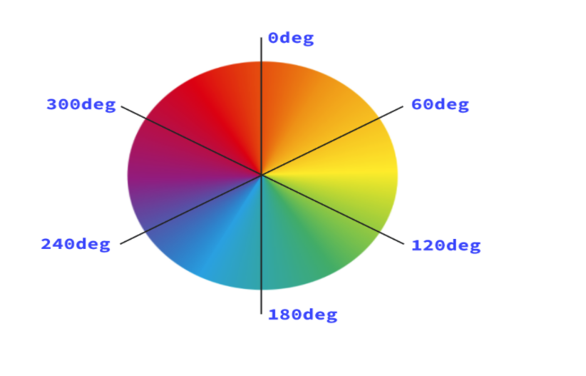
The HSL represents hue, saturation, and lightness. Starting with red, the hue indicates the value on the color wheel from 0 to 360 degrees (being both 0 and 360). A hue of 180, or 50%, falls into the blue category.

The saturation of a color refers to how vivid it is. A completely desaturated color (with a saturation of 0%) appears grayscale. Finally, lightness is a parameter that indicates the scale of extra light from white to black. A lightness of 100% will always result in white.
background-color: hsl(120, 100%, 50%);
                      ^    ^     ^
                      |    |     |--- lightness
                      |    |--- saturation
                      |--- hue
CSS Box-Shadow
The CSS box-shadow property creates shadow effects around an element’s frame. One can set multiple effects separated by commas. X and Y offsets relative to the element, blur and spread radius, and the color is all used to characterize a box shadow.
Using the CSS box-shadow property in CSS.
/* Outer shadow */
.my-element {
  box-shadow: 4px 2px 30px #141414;
}
Result

Using Gradients in CSS
A gradient is an image that can be used anywhere images can be used, but it’s made up of colors, numbers, and angles and is produced with CSS. CSS gradients can be used to create anything from a simple two-color gradient to complex artwork by combining and repeating several gradients.
Linear Gradient
The linear-gradient() function creates a progressive graphic of two or more colors. It accepts several variables, but in its most basic form, you may pass various colors like this, and it will automatically split and blend them evenly.
Example
.my-element {
  background: linear-gradient(#4aa336, #072506);
}

/* Presentational styles */
.my-element {
  width: 250px;
  height: 250px;
}
Result

Radial gradient
The radial-gradient() function comes in handy for creating a gradient that radiates in a circular pattern. It’s identical to linear-gradient(), only you may optionally give a position and finishing shape instead of an angle. If you only give colors, the radial-gradient() function will choose a circle or an ellipse as the center, depending on the size of the box.
Example

You can check out our awesome example list of CSS gradients. Direct Link
Text Spacing and Placement
HTML has some built-in ways for spacing components. You can use the <br> and <hr> elements to space elements in the block direction, which is top-to-bottom in Latin-based languages.
A line break is created when you employ the <br> element, just like when you use the enter key in a word processor.
The <hr> tag creates a horizontal line with a margin on either side.
Example
<article>
<p>This paragraph has a HTML line<br />break in it (between “line” and “break”). This is using a <code><br /></code> element.</p>
<hr />
<p>You can also use a <code><hr /></code> element, which provides a horizontal line and some margin.</p>
</article>Result

Filters in CSS
We can add effects and blur what’s needed in real-time using CSS filters and the backdrop filter. Blur and opacity are only two of the many filters available.
blur
The only argument you can pass is a radius, which determines how much blur is applied. This must be a length unit, such as 15px. The use of percentages is not allowed.
Example
.my-element {
  filter: blur(0.2em);
}
Opacity
The opacity() filter functions similarly to the opacity property in that you can raise or decrease opacity by passing a number or percentage. The element is entirely visible if no arguments are supplied.
Example
.my-element {
  filter: opacity(0.5);
}
Flexbox
The Flexible Box Layout Model (flexbox) is a one-dimensional content layout model. It excels at collecting a collection of things of various sizes and returning the optimum layout for them.
Example
<div class="super-container">
  <div class="container">
    <div>Item One</div>
    <div>Item Two</div>
    <div>Item Three</div>
    <div>Item Four</div>
  </div>
</div>
html,
body {
height: 100%;
margin: 0;
background: linear-gradient(to bottom, #44476e, rgb(42 51 79));
font-family: Arial;
font-size: 20px;
}
.container {
background: #8c73ff59;
display: flex;
flex-wrap: wrap;
padding: 50px;
border-radius: 10px;
max-width: 70%;
margin: 0 auto;
width: 70%;
}
.container div {
background: #48c6b3;
height: 200px;
flex: 1 0 21%; /* explanation below */
margin: 5px;
text-align: center;
color: white;
line-height: 200px;
border-radius: 10px;
}
.super-container {
width: 100%;
background: transparent;
text-align: center;
-webkit-box-align: center !important;
-ms-flex-align: center !important;
align-items: center !important;
-webkit-box-pack: center !important;
-ms-flex-pack: center !important;
justify-content: center !important;
display: -webkit-box !important;
display: -ms-flexbox !important;
display: flex !important;
height: 100%;
}Result

Recommended Articles
- A Spotlight on CSS Viewport Units
- The Awesome CSS mask-image Property
- The CSS justify-self Property
- A Guide on How To Use CSS Grids for Layouts
- The Awesome CSS Transform Property and Scale Function